Practical 4 linear models - linear regression
As you have seen, the t-test is a valuable tool in our statistical toolbox, allowing us to address simple questions like whether means differ between two groups (or treatments). For some biologists, that is the only tool they need. But, most questions in biology represent more complex problems. Linear Models, LMs, are a highly versatile set of statistical tools, widely used to address a range of interesting questions. When applying LMs, we are typically asking questions like "How is rainfall related to species diversity?".
To introduce you to this class of models, we begin with "simple" linear regression. Linear regression is useful when you have two continuous variables: a predictor, or "X", variable, and a response, or "Y", variable. Our null hypothesis is that there is no relationship between X and Y - that is, that the slope of our regression line is zero.
In this practical you will:
- Perform linear regression analysis;
- Learn how to interpret the statistical details provided to you in the output from R;
- Learn how to check if your data meets the assumptions of linear regression;
- Apply your new-found analytical skills to data on birds.
4.1 Starting out nice and simple
We start with a highly simplified, hypothetical example. We want to explore the basis of linear regression analysis without the distraction of the "noise" of real biology.
First, let's enter in a simple dataset:
Y <- c(-3, -2, -2, -1, -1, -1, -1, 0, 0, 0, 0, 1, 1, 1, 1, 2, 2, 3)
X <- c(-2, -1.5, -1, -2, -1.5, -0.5, 0, -1, -0.5, 0.5, 1, 0, 0.5, 1.5, 2, 1, 1.5, 2)
To perform linear regression, we need each of our two variables to be measured on multiple objects (objects are the rows in our dataframe). In our "simple" example data, each value of "Y" has an associated value for "X", and we have these values for each of 18 different objects (individuals).
Let's look at our data. It is customary that we plot the predictor variable on the x-axis (i.e., the horizontal axis) and the response variable on the y-axis (i.e., the vertical axis). Below we use base R syntax to make the plot. Later in the course we will use other tools like ggplot.
## simple plot using the default settings from base R
plot(X, Y)

## Let's make the same plot again, but customize it a little
par(                           ## Customize the graphical window
   mar = c(5, 8, 4, 2),   ## Set margin sizes (in lines)
   las = 1)                ## Print axis tick labels horizontally


plot(X, Y,                  ## Generate a scatter plot of 'Y' versus 'X'
   bty = "n",               ## Do not draw a box around the graph
   font = 2,                ## Use 'bold face' font within the graph
   cex = 2,                ## Double the size of all characters within the graph
   pch = 16,                ## Make the plot symbol a black filled circle
   cex.lab = 3)         ## Triple the size of the axis titles

## run this line to close the plot and reset the graphical parameters
dev.off()
Looking at this plot, do you think that X predicts anything about Y?
Yes! Larger values of X tend to be associated with larger values of Y.
If you were to draw a "line of best fit", how many parameters would you need to define to draw that line?
Two; the intercept, and the slope of the line. The intercept determines where the line "sits" - think of this as the parameter that shifts the line up or down. The slope describes how steep the line is that passes through the relationship.
Does this line explain everything about the relationship between Y and X?
No, otherwise all of the points would be on the line, rather than scattered around it. This scatter gets called a lot of things by different statisticians, which confuses students a lot. It is simply the variation in the response variable that the predictor variable can't explain. We will mainly call it residual variance. In this case residual just means "leftover".
4.2 Fit a regression line
R comes with a function called lm (for "linear model") that performs regression analyses. This function uses "ordinary least squares" to calculate the slope and the intercept.
The lm function (and other types of models in R) uses a ~ character (called a "tilde") to separate the response variable on the left from the predictor variable(s) on the right.
Model1 <- lm(Y ~ X)  ## Regress Y against X and store the result in an object called "Model1"
plot(Y ~ X)          ## We can also use ~ for plotting in the same way! Draw a plot where Y depends on X.
abline(coef(Model1), col="red", lwd=2) ## Use the coefficients (intercept and slope)
## from Model1 to draw the regression line through the data

## A more flexible way to do this is to use 'curve' (we will explain how this works and why it is preferable)
## This plots a thicker, darker line over the 'abline' to show you the difference aesthetically
curve(cbind(1,x)%*%coef(Model1), add =T, col = "darkred", lwd=4)
4.2.1 Understanding and using lm outputs
Above, you used the output from lm to plot a line of best fit using the curve function. To fit a line, curve requires instructions in the form of model coefficients (intercept and slope in this case); we can extract these from Model1 using coef(Model1) - how convenient! Using R "objects" in this way is extremely convenient, but it's important to understand them.
Whenever R creates an object (e.g., the "Model1" object you just created), that object contains various elements depending on the function that generated it.
To determine what is contained within the object you just created, you can use the functions: names and/or str. Try running each of these lines of code one by one and looking at what happens.
Model1               ## Here are the results - the two parameters that define the line!
names(Model1)        ## List the elements of Model1
str(Model1)          ## List the elements of Model1 AND their attributes (this is the 'structure' of Model1)
Model1$coefficients  ## Look at the contents of "coefficients"
coef(Model1)         ## Another way of looking at the coefficients
Model1$residuals     ## Look at the contents of "residuals"
resid(Model1)        ## Another way of looking at the residuals
Model1[8]            ## Look at the 8th element
Model1$fitted.values ## Look at the contents of "fitted.values"
round(Model1$fitted.values, 1)    ## Round those numbers off to one decimal place
As you can see, there's a lot of information available to us about our model, Model1. Let's unpack it slowly.
What is the output of the first line of code telling you?
The regression coefficients: the y-intercept and the slope of the line!
Notice that these are the same numbers shown when you specifically call "coef(Model1)"
What are "fitted" values?
Hypothetical values of Y had each dot landed on the line. You learned about these as "predicted" values in your online stats module.
Notice how there are 18 fitted values, one for each object!
What are "residuals"?
The vertical distance between the observed Y value and its hypothetical "fitted" value along the line. The observed value of Y can deviate above, or below its fitted value, resulting in positive or negative residual values.
4.3 Calculating F-statistics and their degrees of freedom
In regression, the null hypothesis is: "the value of Y does not depend on the value of X", which is equivalent to: "the true slope of the line is zero". We test this hypothesis using ANOVA.
In this week's lecture, you were shown how to calculate an ANOVA table. The purpose is to calculate a test statistic called the "F-statistic".
In R, the job is done using the anova function:
Why do we calculate the sum of the squared vertical distances, and, thus, the Sums of Squares - why not just sum the vertical distances across all of our objects?
If we didn't square them, the mean distance would be zero because of the negative and positive values! We need to square them to understand about the spread - how far the objects are from their predicted value (residual SS) and how far the predicted values are from the mean of Y (regression SS).
The "Regression Sums of Squares (SS)" are the sum of squared deviations of the fitted values (the values that sit along the regression line) from the mean of Y. In our example, the anova output table names this row "X" because is it represents the variation in Y explained by X. If our predictor variable was called "Temperature", then this row would be called "Temperature" in the anova output table.
To calculate the SS of the regression for ourselves, we can first calculate the difference between each of the 18 fitted values and the mean of Y. Above we showed you that we can access the fitted values using fitted(Model1). We then square these differences and sum them.
To get the "Residual SS", the model has already calculated the residuals for us (resid(Model1)). So we just have to square these and then sum them!
## calculate the deviations of the fitted values from the mean of Y
## square these and then sum them
RegressionSS <- sum((fitted(Model1) - mean(Y))^2)
RegressionSS ## View the regression sum of squares

## Square the residuals and then sum the squares
ResidualSS <- sum(resid(Model1)^2)
ResidualSS ## View the residual sum of squares
Did they match the ANOVA table produced by the anova function?
Notice in the code above that the order of the calculations is determined by the use of brackets. The calculations in the inner-most brackets happen first, and then progress through to the outer-most brackets.
Why does the X source of variation only have one degree of freedom in the ANOVA table?
The "fitted values" are constrained to sit on the line. Two points define a straight line and a regression line must pass through the mean of Y. Given this constraint, we have only one degree of freedom.
Degrees of freedom are the sample size minus the number of constraints upon the statistic. We can think of them as the extent to which the numbers in the sample are free to vary in their determination of the statistic. Say we calculate the mean of our sample - once we know that mean, then if we have the value of any 17 of our 18 objects, we can exactly determine the value of the 18th object. Because we must calculate the mean to calculate the deviations of each point from that mean (and from their the Sums of Squared deviations, SS) that means that we have 17 df for the total data, in our simple example.
For the slope, we can define a straight line with two points. We already know that the line must pass through the overall mean of Y and the overall mean of X, so we can estimate the slope from ONE point plus the mean. Thus, we have only one degree of freedom. To demonstrate this, let's make our regression graph again and then use abline to add grey lines that pass through the mean of Y and the mean of X:
Look at your ANOVA output for Model1 again. Why are the Sums of Squares and Mean Squares of X the same, but for the "Residual" they are different?
The Mean Squares are the (Sum of Squares)/(degrees of freedom). For X, we divide 30/1 = 30, so the Sum of Squares and Mean Square are the same. For the Residuals, the the degrees of freedom are n-2 = 16, and the SS/MS= 12/16 = 0.75
The degrees of freedom are incredibly valuable information in an ANOVA table. They help us check that the analysis was correctly conducted (do the df match what we expected based on the sample size of the data?), and help us to check that we are interpreting correctly which effect is which (the Residual degrees of freedom are n-2, while the degrees of freedom for testing the slope will be 1).
Let's continue with re-creating the ANOVA table "by hand" and estimate the Mean Squares:
RegressionMS <- RegressionSS/1
RegressionMS ## look at the number

ResidualMS <- ResidualSS/(18-2)
ResidualMS
Do they match the ANOVA that you generated above?
Once the two Mean Squares are correctly calculated, the "F-statistic" (also known as the Mean Squares Ratio) is straightforward: Divide the MS of the fitted values by the MS of the residuals:
\(F = \frac{s^2_u}{s^2_e}\)
Then, we can ask R to compare that estimated value:
Fratio <- RegressionMS/ResidualMS ## Calculate the F-statistic
Fratio ## look at it - so the regressionMS is 40 times the residualMS

1 - pf(Fratio, 1, 16)    ## Calculate the P-values for the statistic
## based on the F-distribution, the F-ratio, and the numerator (regression) and denominator (residual) degrees of freedom
You can think of the F-statistic as the ratio of the variance explained by the fitted line to the variance not explained by the fitted line. In other words, the ratio of the "relationship signal" to "leftover scatter". In this case the signal of a relationship is much larger than the leftover scatter.
As the amount of explained variance increases relative to unexplained variance, the F-statistic increases. The F-statistic is useful because we know its frequency distribution when the null hypothesis is true (similar to the t-statistic). In this case the null hypothesis is true when there is no relationship. If the value (the F-statistic) is much greater than what we expect when the null hypothesis is true, then we reject the null hypothesis.
Does rejection of the null hypothesis seem reasonable for this data?
Yes. The F-statistic is large (40 times more variation associated with the predictor than the residual) and the P-value is <<0.05.
This makes sense because there is a clear association between X and Y
t-tests can also be performed directly on the regression coefficients; we can "command" R to do this for us using summary:
FYI: for simple linear regression (i.e., where there is a single predictor variable, X), the F-test is equivalent to the t-test for the slope of the line; F is just \(t^2\) in this case!
For our example, should we accept or reject the null hypothesis that the intercept is 0?
Accept. The estimate of the intercept is precisely 0.00 (that is, the sum of positive and negative values for Y in our sample exactly cancel one another out), and we have a very high probability of observing this mean if our null hypothesis was true.
What do you notice about the last lines of output from the summary of our regression model?
It's our ANOVA output. So
summary gives us much of the same information that anova gave us.
4.4 How does bird diversity respond to habitat fragmentation?
To explore how regression can be used in ecology and conservation, let's import the file bird_data.csv into Rstudio.
bird_data<-read.csv("Data/bird_richness_vs_land_use_change_data.csv")

## look at the first six rows of data
head(bird_data)
For this exercise, our specific interest is in how bird species richness responds to habitat fragmentation. Therefore we will treat 'bird_richness' as the response variable and 'fragmentation' as the predictor variable. You can examine the effect of 'lantana_cover' yourself later in the prac. We will also revisit this dataset in the multiple regression prac (week 6).
## Fit a linear model (regression line) to the data and store the results in the R object 'm1'
m1<-lm(bird_richness ~ fragmentation, data = bird_data)
## plot a scatterplot to see the "raw" relationship
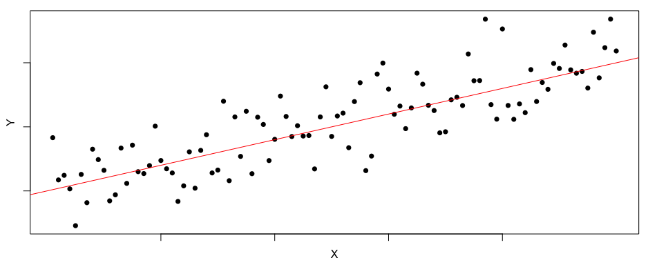
with(bird_data, plot(bird_richness ~ fragmentation))
## Add the regression line over the data using the intercept and slope coefficients from 'm1'
curve(cbind(1,x)%*%coef(m1), add =T, col = "red", lwd=2)Does the scatter plot suggest that bird species richness is statistically associated with the level of fragmentation?
I think that you will agree that the plot of this data looks nothing like the clear, strong association we observed in our simple example.
Nevertheless, a negative relationship is evident in the data and our fitted regression line supports this. What we need to determine is if the relationship is 'steep enough' relative to the amount of 'scatter'. If you're thinking that this sounds similar to the concept of statistical power, you're absolutely on the money!!!
4.5 Understanding power in the context of regression
Previously we learned that statistical power describes our ability to detect a difference between groups (an EFFECT SIZE) when a difference actually exists. We have lower power when the effect size is small, when variance is high (lots of scatter) and when sample sizes are small. The same concept applies to regression, except the effect size is the slope of the relationship, not a difference between groups. So in the regression context, power describes our ability to detect a relationship when a relationship actually exists!
In the figure below you can see how power is affected by the slope of the relationship (the effect size) and the amount of scatter. For the two upper panels, the effect size is large (the slope is steep) but the scatter is twice as large in the upper right plot, resulting in a reduction in power. For the lower two panels, the effect size is small (the slope is quite flat) and the scatter is twice as large in the lower right plot. This lower right plot suffers from a "double whammy" of small effect size and large scatter, resulting in low power to detect the relationship (and a relationship actually exists - John simulated it in R!!!).
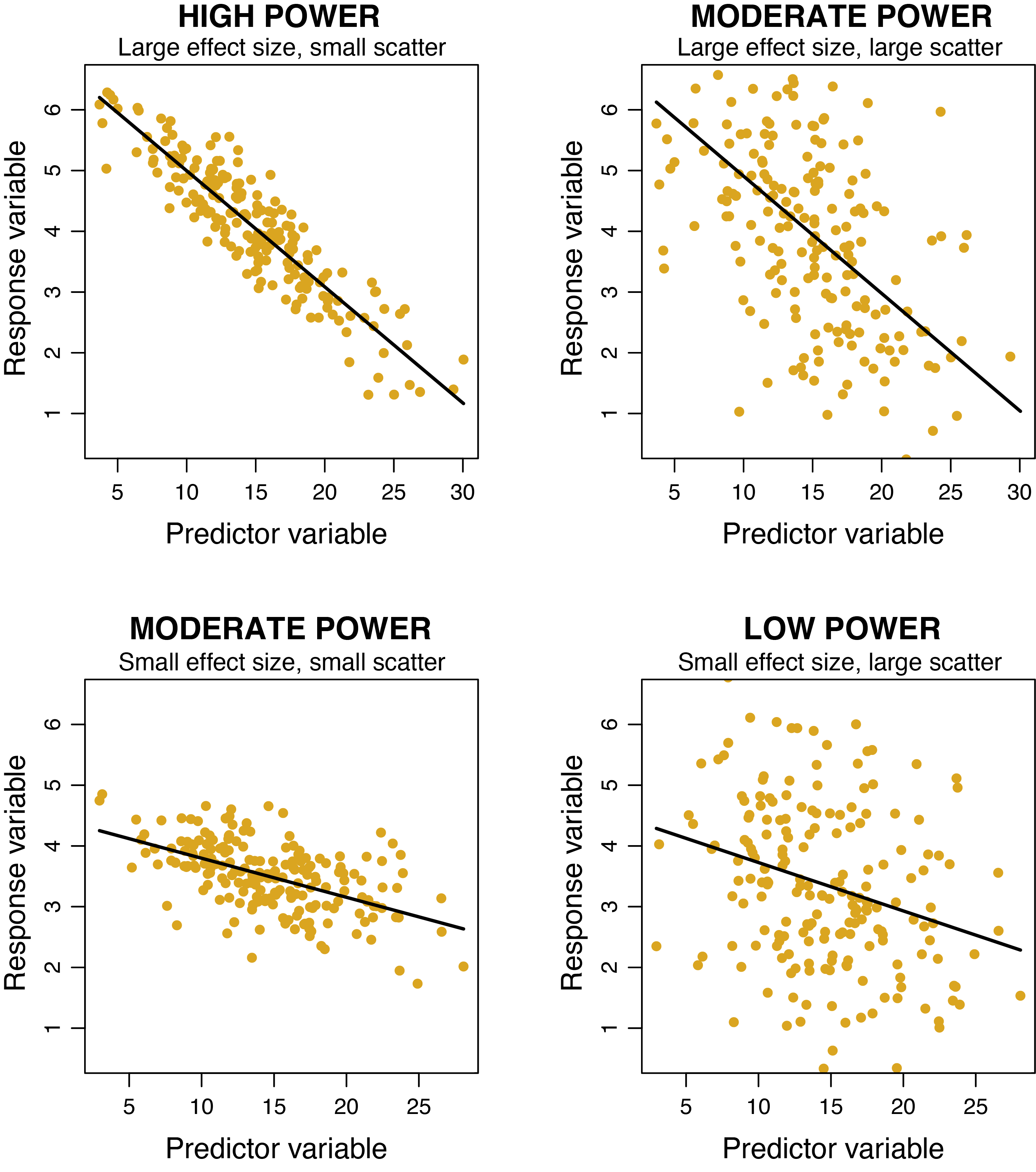
The effect of sample size is not shown in the figure, as all plots have 200 data points. Imagine how power would be reduced in all of the plots if there were only 10 data points instead of 200. Similarly, imagine how power would increase if there were 1000 data points in each plot!!!
4.6 Diagnostics
Although we can easily estimate our regression parameters of slope and intercept, to draw robust conclusions from hypothesis tests based on either the F or t distributions, we need to be mindful of several assumptions of regression that underlie the mathematics and calculation of the ANOVA table.
Key regression assumptions
Residuals are normally distributed (i.e., they have a Gaussian distribution).
Homogeneity of variance - there is no change in the spread of the residuals along the fitted line (as the value of X changes).
Independence - this assumption is one that we need to keep in mind when designing the experiment or survey, and not one that we can directly assess from the data. We need to ensure that the response value for one observation did not influence the response value of other observations. Two common situations when this assumption is violated are (1) when we take repeated measures on the same individual over time, or (2) if our observations are clustered in space. Violating this assumption can inflate our risk of Type I error, but the solution requires more sophisticated analyses than simple linear regression. You will learn more about this later in the course.
X values are estimated without error. This assumption is often not met in biology (we will leave it aside for now), but in a well-designed experiment with sufficiently large sample sizes, it does not have a particularly concerning effect on our inferences.
We also assume that the relationship between X and Y is linear! More about that later.
4.6.1 Normally distributed residuals
There are a few ways to check our first assumption that the residuals are normally distributed. A simple histogram of the residuals would be an intuitive way to visualise this, but we need a bit more information to be sure. There is where a qqplot comes in handy. qqnorm generates a plot where the residuals are plotted against values they would have been had they been perfectly NORMAL. If the dots form a reasonably straight line, then we are OK.
hist(resid(m1)) ## does this histogram look "normal"

## this is a better way to check
qqnorm(resid(m1),  ## Check if the regression residuals are normally distributed
       main = "Residuals of regression of bird richness on fragmentation")
qqline(resid(m1), col = "red")  ## Add the 1:1 line for visualisation
Is there any convincing evidence that our residuals are not normally distributed?
No
The dots form a relatively straight line in the qqplot. Some very small and very large residuals deviate slightly from the line. It takes a bit of experience to know how much deviation is ok. Later we will show you a great package to get a clearer answer.
4.6.2 Homogeneity of variance
What about the other assumptions of linear regression? We can test the homogeneity of variance assumption by plotting the residuals against their fitted values. In essence, this is checking that the scatter (variance of residuals) around the fitted line is the same all the way along the fitted line.
## Check that the residual variance is constant across fitted values
plot(fitted(m1), resid(m1))
## add horizontal line to indicate zero
abline(h=0, col="red")
Is there evidence that the residuals do not have a constant variance?
Maybe?
Again, you might feel a little unsure when you are encountering these checks for the first time. It looks like the spread might be a bit larger for small fitted values of bird richness compared to large fitted values of bird richness.
Fortunately, the DHARMa package does everything we need in a single function. Not only that, but this function can be used on a great variety of statistical models, some of which you will meet later in this course.
## install the amazing DHARMa package onto your computer
install.packages('DHARMa')

## now load the package to use in this analysis
library(DHARMa)

## We will use the 'simulateResiduals' function
plot(simulateResiduals(m1))
The plot on the left is a qqplot overlaid with additional helpful tests of normality. The plot on the right is a more sophisticated "residuals versus fitted" plot. It fits regression lines to the low, medium and high values of the residuals to see if the scatter changes as fitted values increase. These lines pick up the trend that we observed above (that the spread might be a bit larger for small fitted values of bird richness compared to large fitted values of bird richness). But DHARMa reassuringly concludes "No significant problems detected". Phew!!!
4.7 Interpretation
Now that we are satisfied that our data meets the assumptions of the model we have used, we can start to interpret the results!
First, let's look at an ANOVA summary of the model:
Does the ANOVA table provide evidence for a statistical association?
Yes!
The F-statistic is large, and the P-value is <0.001, providing strong statistical support for the alternative hypothesis that bird species richness is related to the level of habitat fragmentation. BUT THIS TEST DOES"T TELL US ANYTHING ABOUT THE NATURE OF THE RELATIONSHIP!!!
Now look at a linear model summary table that has a lot more useful information to help us interpret the results. Remember, the point of statistical models isn't just to generate p-values!!!
## linear model summary
summary(m1)

## plot a scatterplot to see the "raw" relationship
with(bird_data, plot(bird_richness ~ fragmentation, xlim=c(0,17)))

## Add the regression line over the data using the intercept and slope coefficients from 'm1'
curve(cbind(1,x)%*%coef(m1), add =T, col = "red", lwd=2, from = 0)

## add these lines too - they will make sense in a minute
abline(v=0, col="grey", lty=2)
abline(h=coef(m1)[1], col="grey", lty=2)
The intercept is hugely significant (t-value of 30.7!). Is this something to get excited about?
No
Remember, the intercept is where the fitted line crosses the y-axis. In other words, it is the fitted value of bird richness where where fragmentation = zero (i.e. in a completely intact habitat!). In the plot we just created, we extended the limits of the x-axis to zero to demonstrate this point. Notice how the red fitted line crosses the y-axis where bird richness is about 67 species? So our model tells us that, on average, we should expect to find 67 bird species in completely intact habitats. This is useful information, but the t-value and p-value for the intercept are not that useful. In the linear model summary, the t-test for the intercept compares the estimate (66.92 in this case) to a value of zero. Would we ever expect to find zero bird species in completely intact habitat? Of course not!!! So in this case we don't need to worry about the t-value and p-value of the intercept.
What does the slope estimate tell us?
The slope estimate tells us how bird richness changes as the level of fragmentation increases by one unit. In this case, we lose 1.22 bird species for every one-unit increase in fragmentation. The slope estimate is also very significant (t = -5.9; p <0.001), meaning that we are VERY CERTAIN that the slope is not zero. In other words, we are quite certain that the relationship between bird richness and fragmentation is not flat.
4.8 Do it on your own
Try doing your own analysis by looking at the relationship between bird_richness and lantana_cover!!!
What is the model formula (in R) to test the relationship?
If you need to, go back to section 4.4 for guidance
What is the null hypothesis for this analysis?
If you need to, go back to section 4.2 for guidance
How will you test the assumptions of your model are met?
If you need to, go back to section 4.6 for guidance
What test will you use in order to accept or reject the null hypothesis?
If you need to, go back to section 4.7 for guidance