Practical 6 Linear models - Multiple regression
 A major goal of linear regression is to explain variation in our data. In simple linear regression, we explored whether (and how much) variance was explained by a single predictor variable. Often (usually!), we have identified more than one possible predictor variable.
Multiple regressions fit a linear model with two or more predictor variables (e.g. \(X_1\), \(X_2\), \(X_3\), etc) to a single response variable (\(Y\)). These predictors may be two or more continuous variables, or a combination of continuous and categorical predictors. The latter is sometimes referred to as ANCOVA (analysis of covariance) but all of these are just linear models with at least one continuous predictor combined with other continuous or categorical predictors.
In this practical, we will first examine how multiple predictor variables can actually explain "different parts" of the variation in a single response variable. This is something that often confuses students, so it's best to start with a clear and simple proof of concept. We will then delve into the mind-bending world of interactions between two (or more) continuous predictor variables. Remember from our ANOVA lecture and prac that "interaction" has a specific meaning in statistics. Interactions are not the same as "relationships"!!! Instead, interactions tell us if the effect of one predictor variable on a response variable DEPENDS ON the value of another predictor variable. Don't worry if this seems confusing already. We will work through this methodically and use a range of data visualisations to help you understand.
Specifically, we will use datasets on the richness of different animal species to learn about:
- Multiple predictors explaining different parts of the scatter in a single response;
- Interactions among predictor variables;
- Problems associated with correlations among predictor variables;
- Measuring correlations;
- Dealing with correlations.
- Choosing which variables to include in multiple regressions.
Assumptions of multiple regression
In the previous prac, you learned that statistical tests (e.g., linear regression) may be untrustworthy when certain assumptions are violated. We must perform "diagnostic" checks of the model residuals to ensure that our analyses, and the conclusions that we draw from them, are robust.
Here are the assumptions of linear regression that we can check by inspecting the residuals of our analysis (the assumption of independence, which depends on sound experimental design, applies to multiple regression as well, but we will ignore this for now):
- The model residuals are normally distributed;
- Homogeneity of variance - the residuals have a constant variance along the length of a regression line (across the values of X);
- The relationships between the response (\(Y\)) and predictor (\(X_1\), \(X_2\), etc) variables are linear. Linear can simply mean that a straight line is a reasonable summary of the relationship between the response variable and the predictor variable(s). However, as you learned in your lecture, "linear" in linear models is more correctly defined as models in which \(Y\) is predicted by only a linear ("+" or "-") combination of parameters (intercepts, slopes), and does not specify multiplying or dividing any parameter by another parameter, nor having any parameter as an exponent. These more complex models are conveniently called "non-linear models" but we will not cover them in this course.
- Predictor variables are assumed to NOT be strongly correlated - they should not be explaining the same variation in \(Y\). This is an assumption that only affects multiple regression, not simple linear regression.
6.1 How can multiple predictors be included in a single linear model???
This question is best answered with a simple demonstration using data on bird species richness.

Open your CONS7008 R project and save a new blank script for today. Now, let's fly to the bird data.
## Load the tidyverse and DHARMa just in case we need them (we will)
library(tidyverse)
library(DHARMa)

## install a couple of new packages for this week
install.packages("cowplot", dependencies = TRUE)
install.packages("ggeffects", dependencies = TRUE)


## now read in the bird data
bird_data<-read.csv("Data/bird_richness_vs_land_use_change_data.csv")
We can use the wonderful pairs() function to eyeball the data. One way to specify the variables in a pairs() plot is using a formula, like this:
The red lines are "smoothers" that snake their way through the data - they can be helpful to visualise relationships.
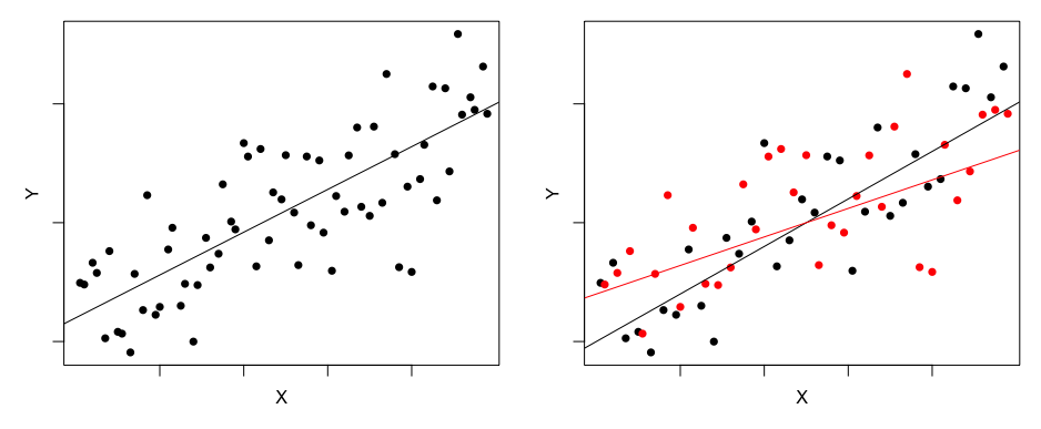
Notice how bird_richness is negatively related to fragmentation (a measure of how fragmented the habitat is) and positively related to lantana_cover (Lantana camara is an environmental weed but it provides shelter habitat for small birds). However, fragmentation and lantana_cover are not at all related to each other. This means that fragmentation and lantana_cover MUST explain different parts of the variation in bird diversity!!!
Let's dig a bit deeper. First fit a simple regression for bird_richness ~ fragmentation
m1<-lm(bird_richness ~ fragmentation,  data = bird_data)

## plot this to see what we have
with(bird_data, plot(bird_richness ~ fragmentation))
curve(cbind(1,x)%*%coef(m1), add =T, col = "red", lwd=2)
So the red line is what fragmentation explains about bird_diversity, but look at all of the scatter!!! We can look at the scatter as the residuals, like this:
arrows(bird_data$fragmentation, bird_data$bird_richness, bird_data$fragmentation, fitted(m1), length=0, col = "cyan")Let's "grab" the scatter by extracting the residuals from m1. I have called this object "bird_richness_not_explained_by_fragmentation".
bird_richness_not_explained_by_fragmentation<- residuals(m1)

## look at a histogram of the residuals
hist(bird_richness_not_explained_by_fragmentation)
abline(v=0, col="red", lwd=3)
## they should be centred on zero - is this what we see?
Finally, look at the relationship between "bird_richness_not_explained_by_fragmentation" and lantana_cover.
So Lantana cover clearly explains variation in bird richness that is NOT explained by fragmentation. This example is proof that multiple predictor variables can explain different parts of the variation within a single response variable. More generally, it means that we can test multiple hypotheses with a single model!!!
6.2 Fitting multiple regressions in R
Fitting multiple regressions is simply a matter of adding more than one predictor variable to an lm() formula. In this case, we can fit a single lm() with fragmentation and lantana_cover using "+". Importantly, just like when using simple linear regression, we need to check that our model meets the assumptions of linear modelling before we attempt to draw inferences.
## fit the multiple regression
m2<-lm(bird_richness ~ fragmentation + lantana_cover, data = bird_data)

## diagnostics
plot(simulateResiduals(m2))## looks fine

## so what does this model tell us?
summary(m2)
6.3 Interactions in multiple regression
In simple linear regression, we care only about the effect of \(X\) on \(Y\). In multiple regression, we care about the effect of \(X_1\) and \(X_2\) on \(Y\). Importantly, the effect of \(X_1\) on \(Y\) may depend on \(X_2\).
This dependence (in their effect on \(Y\)) among predictor variables is known as an interaction effect. You first came across interactions between categorical predictor variables with two-way ANOVA. While it might be difficult to visualise in your head at this stage, we can also fit interactions between two (or more!) continuous predictor variables, and between continuous and categorical predictor variables.
The figures below show the effects of one continuous predictor \(X\) and one categorical (\(Group\): blue/red) predictor on a continuous \(Y\) response variable. The effect of predictor variable \(X\) upon \(Y\) is evident as a positive slope of the line of best fit. In the image on the left, the effect of \(X\) on \(Y\) is identical for two groups (depicted by the blue and red lines); the increase in \(Y\) per unit \(X\) is the same for both groups (the lines are parallel). That is to say: there is no interaction between \(X\) and \(Group\).
In the image on the right, however, the effect of \(X\) is not the same for each group; \(Y\) increases much faster as \(X\) increases for the blue group than for the red group. The effect of \(X\) on \(Y\) depends on which group you look at. That is: there is an interaction between \(X\) and \(Group\).
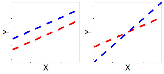
When interactions are present, main effects are harder to interpret: In the figure on the right, which group has larger values of \(Y\)? It depends on where you look along the x-axis. We've provided a simple example here, with one continuous \(X\) variable and one categorical \(X\) variable. Interactions between continuous predictors are more difficult to visualise.
Interactions work by multiplying predictor variables together, and treating the result as a new predictor variable. This is what goes on "under the hood" whenever you include an interaction term in your regression model. A test of interaction is a test of significance of that new predictor variable.
The following code shows explicitly that R processes interaction terms in this way by multiplying fragmentation and lantana_cover together to form a new interaction variable. Literally each value of fragmentation is multiplied by the corresponding value of lantana_cover and this product is treated as a new variable in the model:
## Add the new column to the data set
bird_data$fragmentation_by_lantana_cover<-bird_data$fragmentation*bird_data$lantana_cover

head(bird_data)  ## Check that the new variable has been added
Now, analyse the data with the "fragmentation_by_lantana_cover" treated as a "main effect" (i.e., a typical variable).
m3_manual_interaction<-lm(bird_richness ~ fragmentation + lantana_cover + fragmentation_by_lantana_cover, data = bird_data)

summary(m3_manual_interaction)   ## look at lm summary
Now analyse the data again, but replace "fragmentation_by_lantana_cover" with a less clumsy attempt at fitting an interaction.
m3<-lm(bird_richness ~ fragmentation + lantana_cover + fragmentation:lantana_cover, data = bird_data)

summary(m3)  ## look at lm summary
You see that the two models generate identical statistics! Therefore, including an interaction effect in a model (e.g., fragmentation:lantana_cover) is the same thing as multiplying two variables together and treating the product as another predictor variable in its own right.
Now once more, but use * as follows:
m3_cos_john_hates_typing<-lm(bird_richness ~ fragmentation * lantana_cover, data = bird_data)

summary(m3_cos_john_hates_typing)   ## look at lm summary
fragmentation + lantana_cover + fragmentation:lantana_cover and fragmentation * lantana_cover are equivalent, but the latter makes coding slightly easier. When you start typing out your own code, you'll appreciate the * shortcut.
The regression coefficient (the "Estimate") of the interaction term can be interpreted as follows: For each unit increase in the second predictor variable, the slope of the line of best fit between the first predictor variable and the response variable changes by a certain amount. This amount is given by the regression coefficient for the interaction term. Read this a few times...it's a bit of a head wrecker!!!!
Is there evidence for an interaction between fragmentation and lantana_cover?
What is your general conclusion?
Yes, because the t-value is greater than 2, and the corresponding P-value is quite small (<0.01).
The effect of fragmentation on bird richness depends on Lantana cover. Equivalently, we could say that the effect of Lantana cover on bird richness depends on fragmentation. Statistically there is no difference, but biologically it sometimes makes sense to choose one of these interpretations over the other. Which version makes most sense to you in this case?
6.3.1 Quickly visualising interactions in two dimensions
One way to visualise interactions between two continuous predictor variables is to plot the fitted relationships between one predictor and the response while holding the second predictor at different values. For example, we can plot relationships between fragmentation and bird richness for different values of Lantana cover. Let's try this using John Dwyer's favourite base R function, curve(). We could use the coefficients from 'm3_manual_interaction', 'm3' or 'm3_cos_john_hates_typing' because they are equivalent!!! Let's use 'm3' here (remember, John hates typing).
## define some colours
cols_to_use<-c("skyblue", "goldenrod", "salmon")

## First make a categorical version of lantana_cover
## this is JUST FOR PLOTTING
lantana_cover_cut<-cut(bird_data$lantana_cover, breaks = 3, labels = c("low", "med", "high"))
## the cut function here "cuts" the lantana_cover variable into thirds (breaks = 3)
## and we tell R to call the categories "low", "med" and "high"

## Next choose values of lantana_cover to plot the curves for
## here I am just grabbing low, medium and high values of lantana_cover using the "quantile" function
lantana_cover_vals_to_plot<-quantile(bird_data$lantana_cover, p = c(0.17, 0.5, 0.83))

## make the plot
with(bird_data, plot(bird_richness~fragmentation,col=cols_to_use[lantana_cover_cut], pch=16))
## here we use our 'cut' variable to colour the points

## line for low lantana_cover
curve(cbind(1,x,lantana_cover_vals_to_plot[1], x*lantana_cover_vals_to_plot[1])%*%coef(m3), add=T, col=cols_to_use[1], lwd=3)

## line for med lantana_cover
curve(cbind(1,x,lantana_cover_vals_to_plot[2], x*lantana_cover_vals_to_plot[2])%*%coef(m3), add=T, col=cols_to_use[2], lwd=3)

## line for high lantana_cover
curve(cbind(1,x,lantana_cover_vals_to_plot[3], x*lantana_cover_vals_to_plot[3])%*%coef(m3), add=T, col=cols_to_use[3], lwd=3)

## add a legend
legend("bottomleft", col=cols_to_use, lwd=2, legend = c("low lantana cover", "medium lantana cover", "high lantana cover"))
6.3.1.1 Surely this could be easier?
Using base R to make the previous lovely figure was pretty cumbersome. Fortunately, packages are emerging that make plotting model fits much easier. One such package is ggeffects.
## load the package into this R session (we installed it at the start)
library(ggeffects)

## define a nice "even" version of fragmentation for plotting
fragmentation_vals_to_plot<-seq(3, 17, length.out=200) ## this makes a sequence of 200 numbers evenly spaced between 3 and 17

## remember that above we already defined three values for lantana_cover PURELY FOR PLOTTING
## we called these "lantana_cover_vals_to_plot"

##  Now make the model predictions for the values we want
m3_prediction<-predict_response(m3, terms = c("fragmentation[fragmentation_vals_to_plot]", "lantana_cover[lantana_cover_vals_to_plot]"))

## and plot it!
plot(m3_prediction, show_data = T, show_title = F)
6.3.2 Three-dimensional plots
Another way to view interactions between two continuous variables is as a surface. This may seem strange and confusing for many of you, but let's try it and see if it makes more sense once we see the plot. There are multiple options for visualising surfaces in R, just like there are many options for visualising undulating terrain! Before going on a hike, we might look at a map with contours representing the ground surface, or a map with colours representing the the ground surface. Alternatively we might open up Google Earth and tilt the view to see the terrain from an angle (a perspective view). Let's try visualising our interaction surface in perspective view using the persp() function.
## First, let's make a nice "smooth" version of our continuous predictors
## each with fifteen evenly spaced values ranging from the lowest and highest values of each variable
## Why fifteen? You'll see!
smooth_fragmentation<- seq(min(bird_data$fragmentation), max(bird_data$fragmentation), length.out=15)
smooth_lantana_cover<- seq(min(bird_data$lantana_cover), max(bird_data$lantana_cover), length.out=15)

## Next, define a function that we can use to generate the full interaction surface using our "smooth" variables
surface_func<-function(var1, var2) (cbind(1, var1, var2, var1*var2)%*%coef(m3))

## now use "outer" to make the surface
smooth_bird_richness<-outer(X = smooth_fragmentation, Y=smooth_lantana_cover,  FUN=surface_func)
## Here, outer() takes smooth_fragmentation and smooth_lantana_cover and applies them to the surface function we made

## now plot the surface using "persp"
persp(y = smooth_lantana_cover, x = smooth_fragmentation, z=smooth_bird_richness,
      theta = 45, phi = 30, col="goldenrod")
## We can play around with theta (angle to spin the plot) and phi (angle to tilt the plot)
## See how the surface is made up of a 15 x 15 cell grid?
## That's because we chose length.out=15 when we made out smooth variables.
## We could have used five, or 100...whatever looks best!
Let's discuss the pros and cons of the different visualisation options as a class.
6.4 Other types of interaction surfaces
Next, we will use a different dataset to examine how skink species richness varies with climate variables. This example is important because it demonstrates the power of using interactions to find important relationships that are not evident when we look at simple scatterplots of the data.
skink_data<-read.csv("Data/skink_richness_vs_climate_data.csv")

## look at pairwise scatterplots of the three variables using pairs()
with(skink_data, pairs(skink_richness ~ temperature + rainfall, upper.panel=panel.smooth))
So in this example we see no obvious relationships between skink richness and the two climate variables. Does this mean that climate has no influence over skink diversity??? We can fit a multiple regression with an interaction to see if there is actually more going on here.
## fit a model and include an interaction between temperature and rainfall
m4<-lm(skink_richness ~ temperature + rainfall + temperature:rainfall, skink_data)
## check diagnostics (always!!!)
plot(simulateResiduals(m4))

## look at summary
summary(m4)
So there IS a strong and significant interaction. Let's visualise it using two- and three-dimensional approaches. We'll picture them side-by-side so you can see that they are showing us the same thing (one more clearly than the other, we realise).
## we can combine ggplot and base R plots using the "cowplot" package
library(cowplot)

## TWO-DIMENSIONAL PLOT
## choose values of rainfall to plot the curves
## Again I use quantile to get low, medium and high values ( and I round up using "ceiling" to remove decimals)
rainfall_vals_to_plot<-ceiling(quantile(skink_data$rainfall, p = c(0.10, 0.5, 0.90)))

## define a nice "even" version of temperature
temperature_vals_to_plot<-seq(3, 17, length.out=200) ## this makes a sequence of 200 numbers evenly spaced between 3 and 17

##  Now make the model predictions for the values we want
m4_prediction<-predict_response(m4, terms = c("temperature[temperature_vals_to_plot]", "rainfall[rainfall_vals_to_plot]"))

## and plot it!
m4_plot<-plot(m4_prediction, show_data = T, show_title = F) +
  theme(legend.position = "bottom")


## THREE-DIMENSIONAL PERSPECTIVE PLOT
smooth_temperature<- seq(min(skink_data$temperature), max(skink_data$temperature), length.out=15)
smooth_rainfall<- seq(min(skink_data$rainfall), max(skink_data$rainfall), length.out=15)

## redefine surface function using coefficients from m4
surface_func<-function(var1, var2) (cbind(1, var1, var2, var1*var2)%*%coef(m4))

smooth_skink_richness<-outer(X = smooth_temperature, Y=smooth_rainfall,  FUN=surface_func)

par(mar = c(1, 1, 1, 1)) # Setting all margins to 2 lines
persp(y = smooth_rainfall, x = smooth_temperature, z=smooth_skink_richness,
      theta = -45, phi = 30, col="goldenrod")

persp_m4_plot<-recordPlot() ## this is a bit weird - we need to "record" the base R plot


## Now combine them
combined_plots<-plot_grid(m4_plot, ggdraw(persp_m4_plot), nrow=1, rel_widths = c(1.5, 1))

## save to an output file
ggsave(file = "Outputs/combined_plots.pdf", combined_plots, width = 10, height = 5)
This is an example of a strong interaction that actually switches the direction of relationships. The effect of temperature on skink richness flips from positive to negative depending on the amount of rainfall!!! Look at the two plots of the interaction. Can you see that they are showing the same thing???
Before we move on, we need to tell R to close this two-panel device or else all plots will have two panels from now on. Simply turn off the plotting device like this:
6.5 Correlations among predictor variables
An assumption of multiple linear regression is that the predictor variables are independent (i.e., uncorrelated). In practice, predictors are often likely to share variation to some extent, but the more substantial this "multicollinearity" becomes, the lower our confidence in estimates of the regression parameters (slopes). Thus, while we might be confident that overall our model does a good job predicting \(Y\), we cannot say which of our predictors are contributing.
We will use a dataset on tree species richness to demonstrate the issue of multicollinearity.
tree_data<-read.csv("Data/tree_richness_data.csv")

## look at pairwise scatterplots of the three variables using pairs()
with(tree_data, pairs(tree_richness ~ moisture_index + soil_moisture, upper.panel=panel.smooth))
So the two predictor variables are very correlated with skink_richness, but they are also VERY correlated with each other!!! Places that have higher moisture index values (more rain) also have more moisture in the soil (perhaps unsurprisingly). We can quantify how correlated these two variables are using a "correlation coefficient" that varies between -1 and +1; +1 means perfect positive association (a straight line relationship), zero means no association, and -1 means perfect negative association.
## use the `cor` function from base R to generate the matrix of correlation coefficients
cor(tree_data)

## use the `round` function to round these to three places (easier to read)
round(cor(tree_data), 3)
What do you notice about the values on the diagonal of this matrix?
They are all exactly 1.
This is an estimate of the association between a variable and itself. Unsurprisingly, a variable is perfectly correlated with itself :-)
Is the correlation coefficient always an adequate summary of the association between two variables?
No.
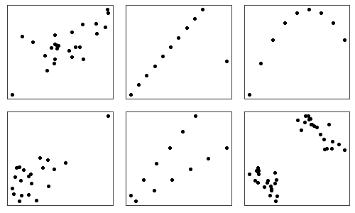
First, it ignores non-linearity that may exist in a statistical association. Second, the same correlation coefficient can apply to data that exhibits markedly different pattern of association when plotted in a scatter plot. For example, these plots all have a correlation coefficient of ~0.7.
6.5.1 Variance inflation factor (VIF)
This statistic is built upon regression analysis. It is obtained by regressing a predictor variable against all the other predictor variables, and then looking at the multiple \(R^2\) of that analysis
\(vif = \frac{1}{1-R^2}\)
The following code shows how to manually calculate "vif" for moisture_index.
## Manually calculate 'vif' for moisture_index
fit <- lm(moisture_index ~ soil_moisture, data=tree_data)

1/(1 - summary(fit)$r.squared)
As a gauge of correlation, the "rule of thumb" is: When \(vif > 10\), correlation among predictor variables is large, and caution is required when interpreting the parameter estimates in a multiple regression analysis for any response variable.
We can do this far more easily using the vif() function from the car package.
## fit a model with both predictors (even if we suspect it is problematic)
m5<-lm(tree_richness ~ moisture_index + soil_moisture, data = tree_data)

## Load the library that contains the "vif" command
library(car)

## Look at the variance inflation factors for both predictors
vif(m5)

## also look at a model summary to see the issue of multicollinearity
summary(m5)
Based on the pairs plot above, how can moisture_index NOT have a significant positive relationship with tree_richness??? It's because we have violated an important assumption of multiple regression - that the predictors are not strongly correlated.
In these cases it is advisable to choose just one of the correlated predictors and remove the other one from the model. Often we choose the predictor that we expect (based on available knowledge of the system) to have the most logical influence over the response variable, or we choose the variable that allows us to compare our results most directly to other studies. If our hypothesis was specifically about soil moisture, then we would use this predictor. Alternatively, if our goal was to compare richness ~ climate relationships with those observed elsewhere in the world, we might use moisture_index because it is used by researchers globally to try and explain tree diversity. It's a matter of logic and scientific context, not right or wrong.
6.5.2 A note about choosing predictor variables
There are many approaches for selecting which variables to include in multiple regressions and other statistical models that permit more than a single predictor. These different approaches are underpinned by different statistical philosophies - none are right or wrong but some will be more appropriate for a given situation than others. This often frustrates students, as they want clear rules to follow!
To explain what we mean here, imagine that we have two hypotheses about tree richness: (H1) tree richness increases with moisture availability and (H2) tree richness increases with soil phosphorus levels (note: here we are just testing multiple alternative hypotheses about tree richness. The null hypothesis is that tree richness is not related to either variable). We will create a new variable for the tree_data dataframe called 'soil_phosphorus' and force it to be completely uncorrelated with other predictors and to the response. This is purely to demonstrate a point.
## create a completely random predictor and add it to the tree_data dataframe
## first, work out how many rows of data are in tree_data
dim(tree_data) ## 150
## now make the new variable using rnorm() ('R'andom draw from a 'NORM'al distribution)
tree_data$soil_phosphorus<-rnorm(150, 10, 2)

## add this variable to a new model with moisture_index
m6<-lm(tree_richness ~ moisture_index + soil_phosphorus, data = tree_data)

## look at the lm summary
summary(m6) ## note, your results will differ a bit from your neighbours
## because our new variable was randomly generated (so is different for everyone)
We could stop with this model and then discuss that we found strong support for H1, but no support for H2. This would be completely sound. Alternatively, we could have asked a more general question instead of posing specific hypotheses. For example, "Do environmental variables explain tree species richness?" To address this question, we would fit the same model (m6), but we might then adopt the principle of 'parsimony' which strives to present the simplest model that best explains variation in the response variable. In this case we would go through another step and simplify our model (remove soil_phosphorus). The scientific conclusions would be quite similar (moisture index is a strong predictor of tree richness but soil P is not), but the philosophies underpinning the approaches differ slightly. Alternatively we could have used model averaging, or even Bayesian inference...the options are many and varied.
The most important thing is to use a model that clearly and directly addresses your hypotheses or questions. The biological conclusion should not differ depending on your approach (not in any important way anyway).
6.5.3 Try fitting and visualising an interaction yourself!
In the model above (m6), we created and added the "soil_phosphorus" variable. Even though we created the variable so that it was not related to the response variable (we just drew random values from a normal distribution), pretend that we are interested in testing a possible interaction between moisture_index and soil_phosphorus. Indeed, there are good ecological reasons to expect that such an interaction might exist. Create a new model called "m7" and include an interaction term. Then run through the steps of checking diagnostics and looking at the model summary. Even if the interaction is not significant, go ahead and try and plot it anyway. Try a variety of plotting options. Do the plots match your expectations?