Practical 10 Principal Components Analysis
 In biology, shared variation (or "covariance") among variables is very common. In this practical you will learn more about how to implement and interpret Principal Components Analysis, or PCA. Remember, PCA has three benefits to us when dealing with multivariate data:
It can reduce complexity. That is, it provides a way of reducing the number of variables required to describe the data down to fewer variables while still accounting for most of the variation in the recorded variables. This is called "dimension reduction", and is a widely used approach to be able to investigate data multivariate data.
It can help to identify interesting biological patterns, including indicating the presence of "latent" factors that are responsible for variation in multiple different variables.
It provides variables that are uncorrelated with one another which can be used in further analyses. In previous weeks, you saw that correlation among predictor variables violates some assumptions of linear models, and can cause uncertainty for hypothesis testing.
In this practical, we will first work with very simple, two-variable, data to help you understand what PCA is doing. We will then analyse real data, and lead you through how to interrogate the output to understand the biology captured in that data. In the next practical, you will then use PCA to overcome the limitations of correlations among explanatory variables and test hypotheses.
10.2 Turning our correlated data into uncorrelated data
PCA rotates the data (using matrix algebra that we don't get into in this course) to a new set of uncorrelated axes, and in doing so, converts correlated data into uncorrelated data. Remember: the sequential PCs in PCA are "orthogonal" to one another - which means that they are uncorrelated.
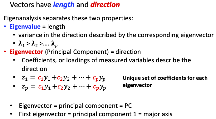
The first step of PCA is to estimate the covariance (or correlation) matrix, and to then subject this to an "eigen-analysis". There are two outputs from this analysis that we need to interpret: The "eigenvalues", which are the variances of each of our new variables (the length of the new Principal Components, PC, axes) and; the "eigenvectors", which are our new variables (the direction of the new axes that we have rotated our data to, the PCs). You should recall that from the lecture:
Using the code below, implement the PCA (using the eigen function) on the data that you simulated in the last activity, and then inspect the eigenvalues and eigenvectors (PCs). The following activities will help you understand how to interpret these.
PCA <- eigen(Vmatrix)           ## Calculate eigenvalues and eigenvectors
round(PCA$values, 3)            ## Look at the eigenvalues
round(PCA$vectors, 2)           ## Look at the eigenvectors
10.3 Principal Components (Eigenvectors)
The PCs are the key to converting the correlated data into uncorrelated data. Each PC is a list of numbers, which are the loadings, or coefficients that quantify how much each of the original data variables contributes to this new axis.
When we plotted our simulated data above, the position of each point is determined by their Y1 and Y2 values (i.e., where the points fall along the Y1 and Y2 axes). Using these axes as our "coordinate system" to plot the data, we observed that that our variables are highly correlated (~0.8).
The PCs describe a new coordinate system, and when we plot the data on this new coordinate system, we will observe that the "variables" (PCs) are uncorrelated.
First, plot the data again, but this time, let's add the new axes, defined by the eigenvector coefficients (PC loadings):
## Make the plot dimensions square ("s") to help us to visualise the new axes
par(pty = "s")

## Set the range for the two axes
AxisRange <- range(data)

## Produce the plot from above, but for centred data
plot(data[,1], data[,2],  ## Plot the two variables
     xlim = AxisRange,        ## Set the range of Y1 values
     ylim = AxisRange,        ## Set the range of Y2 values to be identical to the range of Y2 values
     xlab = "TotalLength",    #label the axes to hel you remember what we are plotting
     ylab = "TailDepth")

#plot(data[, 1], data[, 2], xlab="Y1", ylab= "Y2") ## Scatter plot the two
## Now plot straight lines that go through the origin (0, 0) and the coordinates of the eigenvectors (one at a time)
## Recall that the slope of a straight line is equal to the rise/run:
abline(0, PCA$vectors[2, 1]/PCA$vectors[1, 1], col = "red")   ## Plot a line the for the first PC in red
abline(0, PCA$vectors[2, 2]/PCA$vectors[1, 2], col = "blue")  ## Plot a line the for the second PC in blue

## Reset the plot dimensions
par(pty = "m")
Because we "scaled" both TotalLength (Y1) and TailDepth (Y2), both the variables have the same variance (1.0), and the data is "centered" - meaning that the lengths and depths of each fish are the deviations from the mean of the variable. This is convenient for plotting the new PC axes - as you can see, for this data, their origin (where the red and blue lines cross) is in the middle of the data.
How can you tell that, if we plotted the data on our new coordinate axes, that the data will be uncorrelated?
The red and blue lines are perfectly perpendicular (at right angles; AKA they are "orthogonal", just like the Y1 and Y2 axes).
NB: it is easy to see in the plot that the red and blue lines (the PCs) are orthogonal because we made the plot square and the axes identical. If the plot dimensions were not square, or the axes were different, then the PCs may not appear to be perpendicular, but the maths of PCs means they are ALWAYS orthogonal (perpendicular)
What information in the above plot tells us about the relative length of each PC (i.e., the magnitude of their associated eigenvalue)?
The first eigenvector (red line) is associated with the MAXIMUM scatter of points - points fall all along the length of the red line. In contrast, the data is clustered about a the origin of the second eigenvector (the blue line).
10.4 PC scores
The eigenvectors define our new axes, so now let's rotate our data to those new uncorrelated axes. To do this, we calculate the "PC score" for each individual object (in our example, each fish); the object's value for each variable is multiplied by the respective eigenvector coefficient for that variable, and then these products are added together to give the score. For a score on the first PC in our two variable example:
- multiply the Y1 value by the coefficient for Y1;
- multiply the Y2 value by the coefficient for Y2;
- sum the two values.
Go ahead and do this for the first object in our data. Run each line of code and look at it to follow the three steps:
data[1, 1] * PCA$vectors[1, 1] #Step 1: multiply object 1's value for Y1 by PC1's loading for Y1
data[1, 2] * PCA$vectors[2, 1] #Step 1: multiply object 1's value for Y2 by PC1's loading for Y2

data[1, 1] * PCA$vectors[1, 1] + data[1, 2] * PCA$vectors[2, 1] #Step 3, sum the two products to calculate the PC1 score for the 1st object in the dataset

## R might label the PCscore as "TotalLength" - don't get confused.
How would you calculate the PC score for the sixth object for the second eigenvector? Try it!
data[6, 1] * PCA$vectors[1, 2] + data[6, 2] * PCA$vectors[2, 2]
Thankfully, we don't have to do this for each eigenvector for each object, R can take care of this using some matrix algebra code (%*% means 'matrix multiply'):
PC_scores <- data %*% PCA$vectors ## calculate PC scores for all objects and PCs
colnames(PC_scores)=c("PC1", "PC2")
head(PC_scores)   ## Look at the first six objects
How do PC_scores[1, 1] and PC_scores[6, 2] compare to what you calculated manually? Hopefully exactly the same!
Instead of having Y1 and Y2 values for each object (TotalLength and TailDepth for each fish), we now have PC1 and PC2 scores for each object. In other words, instead of having values that define where points fall along the Y1 and Y2 axes, the values for each object now define where points fall along the eigenvectors (the red and blue lines for PC1 and PC2, respectively, that you plotted before).
Our goal was to take a set of correlated values and make them uncorrelated. We now have a new data set, 'PC_scores'. Did it work?
VmatrixPCA <- var(PC_scores)  ## Calculate the covariance matrix and store it
round(VmatrixPCA, 3)  ## Look at the variance covariance matrix of PC_scores
What is the covariance between the new variables?
Zero; the two variables are completely uncorrelated!
How do the variances of VmatrixPCA compare to the eigenvalues of the covariance matrix of simulated data that you analysed (Vmatrix)? HINT: you can recall them from your stored R objects to view them: PCA$values.
They are identical! The eigenvalue describes the variance along the eigenvector. The first eigenvalue is large because the points are most spread out along this axis (red line in the plot). Remember, PCA always finds the longest axis first, and then it finds the 2nd longest axis that is uncorrelated to the 1st.
Let's plot the original data side-by-side with the PC data.
Range <- range(data, PC_scores) ## Prepare the plotting range

par(mfcol = c(1, 2))                ## Set up space for two graphs, side by side
plot(data[, 1], data[, 2],  ## Plot the original data
     xlim = Range,          ## Set the axes range
     ylim = Range,              ## Set the axes range
         xlab = 'TotalLength',      ## Label the vertical axis
         ylab = 'TailDepth')           ## Label the horizontal axis

plot(PC_scores[, 1], PC_scores[, 2],    ## Plot the new data
     xlim = Range,            ## Set the axes range
     ylim = Range,              ## Set the axes range
     xlab = 'First principal component',            ## Label the vertical axis
     ylab = 'Second principal component')       ## Label the horizontal axis

par(mfcol = c(1, 1))                    ## Reset to just one graph per page
Compare the two scatter plots.
How did PCA eliminate the correlation between the two variables?
It rotated the data to new axes (PCs) such that the sample covariance was exactly zero. NOTE: while the eigenvalues (i.e., variances of the PCs) will vary depending on the variances and covariances of your original dataset, the covaraince bewteen PCS will ALWAYS be zero.
What information in the figure conveys information on the eigenvalues?
The first eigenvector describes the dimension with the MAXIMUM spread on the data (hence, the highest variance);
PC_scores[, 1] are the values for each object along that dimension. The second eigenvector spans a dimension perpendicular to the first; PC_scores[, 2] are values along that dimension.
Correlated data are turned into uncorrelated principal component scores by rotating the data. Note that this does not change the data; it only changes the way we read the data.
We can demonstrate that no new information has been generated when we perform a PCA. Compare the total variance (this is the "trace" that you learnt about last week) of the original simulated data, to the total variance in the data after we rotate it to the PC axes (the sum of the eigenvalues):
Vmatrix[1, 1] + Vmatrix[2, 2]   ## Sum of the variances (i.e. total variance)
PCA$values[1] + PCA$values[2]   ## Sum the eigenvalues
What tells you that PCA has not generated any new information?
The sum of the variances equals the sum of the eigenvalues.
Which dimension has the least spread of data?
- data[, 2]
- PC_scores[, 1]
- data[, 1]
- PC_scores[, 2]
- None, the spread is always the same
d. The last (in this case, the second) principal component always describes the dimension with the least variance! If the variables in the raw data were not correlated, then the last eigenvalue and the original variable with the least variance will have equally low variance.
10.5 Eigenvector loadings and understanding PC scores
We have converted our Y1 and Y2 variables into PC1 and PC2 variables, but what exactly do these principal components represent?
The key to this question is, again, the eigenvectors. Have a look at the first eigenvector: PCA$vectors[, 1].
There are two numbers. The first number is the coefficient for the first variable (Y1, "TotalLength"), and the second number is the coefficient for the second variable (Y2, "TailDepth"). Two things are important:
The size of the coefficient which tells you about how much a variable contributes to that eigenvector;
The sign (positive/negative) of the coefficient RELATIVE to the other coefficients for that eigenvector. This tells us about whether that variable increases or decreases along the eigenvector.
In our two-variable zebrafish data, PCA$vectors[, 1] has coefficients of Y1 and of Y2 that are ~0.7 (both positive or both negative - we'll return to this point in the box below). PC1 is a variable that represents the positive relationship between Y1 and Y2 (remember: you saw the positive trend and reasonably tight clustering of points along that trend when you plotted the data on the original measured variable axes). In this example dataset, we expected both variables to contribute to PC1 (because they share variation with one another!), and we scaled the data so both variables had equal variances (1.0), so we expect Y1 and Y2 to contribute equally.
Let's think about the biological interpretation of PC1 and PC2. PC1 captures that general pattern seen in the correlation between the two variables: as TotalLength increased (decreased) TailDepth also increased (decreased). Then, PC1, with similar size and same sign (+ or -) coefficients of the two variables can be interpreted as 'size', a composite variable that includes information about length and depth. PC1 is not just some abstract statistical 'variable', it is a new, biologically meaningful variable that we could analyse further.
What might PCA$vectors[, 2] represent? What biological interpretation could you place on PC2?
The coefficients are similar in size, but have opposite signs. That means that PC2 is a variable that describes variation along an axis where Y1 gets larger and Y2 gets smaller (and vice versa). PC2 can be thought of as an 'asymmetry of length and depth' variable.
- !
For our simple zebrafish example, what does it tell you if an individual has an extreme value for PC2?
PC2 contrasts at one end of the axis fish that are relatively short but have relatively deep tails, and at the other end of the axis, fish that are relatively long but have shallow tails. Again, this might be biologically interesting - for example, we might find that males and females differ in the relative depth of their tail, afer we account for overall differences in size (PC1).
What do the eigenvalues (PCA$values) tell you? What might be the biological meaning for our zebrafish example?
Most of the spread of the data is along the first eigenvector.
That means that most variation is along an axis that describes overall 'size' (PC1). There is only a little bit of variation associated with 'asymmetry of length and depth' (PC2).
Eigenvector loading signs
Before going any further, we will make one more point about the eigenvectors. It is possible that the eigenvectors from your analysis look different to those of your colleagues, and specifically that they have opposite signs.
First, recall the plot you made before where the data is centered, so the average on each axis (i.e., the centre of the axis) is zero. Eigenvectors define the direction from the p-dimensional data centroid - that is, in our two-variable example, the direction from [0,0] coordinates. This means that eigenvector loadings correspond to what we might think about as "half of the axis", describing the direction from the centroid, while the eigenvector axis passes through the centroid. It is arbitrary then which half of the eigenvector axis the loadings describe. The eigen function in R often, especially for the 1st eigenvector, returns the vector pointing "down" (all of, or the largest of, the loadings are negative numbers). Because the positive or negative orientation from the centroid is completely arbitrary, we can readily reverse direction along the axis if it is helpful for either interpreting the biology from the loadings, or the ordination of our objects on the axis. We simply multiply the eigenvector by the constant -1.0 (i.e., multiply each variable's loading on that eigenvector by -1 to flip the sign). The figure below to illustrates this, where only the first eigenvector is plotted. The solid half of the red arrow (pointing down and left for this example) is where the loadings would be negative, while the dashed half of the arrow (pointing up and right) would be described by both positive loadings. The data centroid is the intersection of the two dotted black lines (i.e., the mean of each original variable axis), and you can see that the dashed and solid red lines are simply two halves of the axis, above or below the centroid.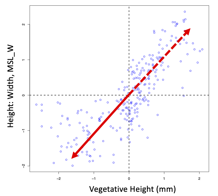
10.6 Zero eigenvalue
As we hope that you have seen in the first activities, PCA tells us about the extent of correlation among the variables.
A correlation coefficient is a number between +1 and -1. The extreme cases of +1 and -1 apply when two variables are identical, or exact scalars of one another.
In order to illustrate the point, we will artificially add a new variable, Y3, to the data. The new variable is perfectly correlated with an existing variable.
## Organise the numbers into a data frame
data <- as.data.frame(data)

## Generate a new, third variable, that is totally determined by the first variable
data$Y3 <- data$TotalLength ## Copy the data from the first column into a new column
pairs(data) ## Scatterplot each raw data variable against every other
cor(data)   ## Look at the correlation matrix
What tells you that data$Y3 is completely determined by data$TotalLength?
The perfect, straight line relationship shown by the plot. Also, their correlation coefficient it exactly +1.
How would you create a correlation of exactly "-1"?
data$Y3 <- -data$TotalLength or data\(Y3 <- -1*data\)TotalLength
Such extreme dependence among variables translates into a zero eigenvalue in the PCA of the data. Go ahead and check:
Vmatrix <-  var(data)   ## Estimate the sample covariance matrix
PCA <- eigen(Vmatrix)   ## Extract the eigenvalues and eigenvectors
round(PCA$values, 4)        ## Look at the eigenvalues
One of the eigenvalues is zero.
If an eigenvector is associated with an eigenvalue of zero, how much variance is in that eigenvector?
None!
We have seen that PCA removes (i.e., makes zero) the correlations among variables in a data set by rotating the axes and so changing the way the data are read. Run the following code to see how that works with the present data set containing a zero eigenvalue.
PC_scores <- as.matrix(data) %*% PCA$vectors  ## Convert the data to PC_scores
round(var(PC_scores), 4)                            ## Look at the covariances of the PC scores
Is there truly a third principal component to this data?
No; the zero eigenvalue is saying that there is a dimension with zero variance. This tells us that there is redundancy in the data, such that we can explain all of the variation with less PCs than original variables. The loadings are then all zero: if there is no spread of the data along this axis, then all deviations from the centroid are zero.
A zero eigenvalue is the easiest way to identify redundancy among variables. Our example was pretty silly - we really didn't need the eigenvalues to tell us that Y3=TotalLength. However, complex and subtle dependencies that are not obvious from scatter plots or correlation coefficients can be revealed by looking at the eigenvalues. This is particularly true when we have many more than three variables of interest.
10.7 Summary so far...
Correlation among explanatory variables is problematic for data analysis. By rotating our data to a new co-ordinate system, we can remove correlations, and work with uncorrelated principal components.
We use the eigenvector coefficients to determine what a particular principal component represents, and potentially identify biologically interesting variation (such as asymmetry of length and depth!).
The first principal component always spans the dimension of maximum spread of the data in multivariate (p-dimensional) space. The second principal component spans the dimension perpendicular (orthogonal) to the first that explains the next most spread of the data (for three dimensional data, the third principal component would be perpendicular to both previous axes, and be the third longest axis that meets that criterion of being uncorrelated).
An eigenvalue of zero tells you that there is complete redundancy in your data and you can work with fewer dimensions without losing any information. It will be more common that we have redundancy that is not complete, but where we can still keep most variation with fewer axes (dimensions) than originally measured variables.
10.8 Other levels of association in data
This example showed you what happens in a PCA when two variables are strongly (positively) correlated. You can explore that happens with other types of correlations using data simulation.
## Simulation of correlated data ##
samplesize <- 100           ## Set the sample size (number of rows)
means <- c(1.0, 1.0)            ## Set the two means
covmatrix <- matrix(c(1.0, -0.5,        ## Set the variances to 1.0 and covariance to -0.5
                      -0.5, 1.0), nrow = 2, ncol = 2)

## Generate correlated, Gaussian, random numbers
library(MASS) ## Load the library containing the `mvrnorm` function
simdata <- mvrnorm(samplesize, means, covmatrix)  ## Generate the numbers
colnames(simdata) <- c("Y1", "Y2")
head(simdata)    ## Look at the first few rows

## Now produce a "scatter plot" of the random numbers that you just generated
plot(simdata[, 1], simdata[, 2], xlab="Y1", ylab= "Y2") ## Scatter plot the two variables
simVmatrix <- round(var(simdata), 3)  ## Estimate the sample covariance matrix
simVmatrix                                  ## Look at the sample variances and the covariance
What did you expect the sample variance for each variable to be? Remembering that we have simulated this data, do you expect to observe this value?
The expected value (the "true value") is 1.0 for each variable. The sample variance (the variance of our 100 sampled values) is not equal to 1.0 for either variable because of sampling error. Did you get the same variance as your lab partner? What about if you run the simulation again - do you get the same?
Is the sample covariance exactly -0.5? Why/Why not?
No, the sample covariance is not equal to -0.5 (the "true value") because of sampling error.
Go ahead and conduct a PCA on these data eigen(simVmatrix) and inspect the eigenvalues and eigenvectors. How does this analysis compare to the analysis of TotalLength and TailDepth? You have the power now to investigate any type of association you like!
10.9 Zebrafish
Let's explore PCA further through a more thorough analysis of the zebrafish data. These data contain four potential predictor variables of interest that we might want to include in a multiple regression to predict swimming speed:
- fish length ('TotalLength');
- tail depth ('TailDepth');
- body depth ('BodyDepth');
- head length ('HeadLength').
Now that we are no longer dealing with just Y1 and Y2 it is harder to visualise the required four dimensional space, but that is where PCA can help!
These are all measures of fish size and shape, and as you have seen for the first two, we might expect all of them to be correlated to some extent. Have a look:
round(cor(zebrafish[, 6:9]), 3)   ## Look at the correlation coefficients
pairs(zebrafish[, 6:9])           ## Observe the pairwise plots
Is there evidence for redundancy among these four variables?
Very likely; the correlations are all very strong, although none are exactly equal to +1 or -1.
Now look at the eigenvalues of the covariance matrix (notice: this time did not scale the data first, so we are working with the variance-covariance matrix, and differences among the variables in their "spread" will influence the patterns we see):
Vmatrix <- var(zebrafish[, 6:9])  ## Estimate the sample covariance matrix
PCA <- eigen(Vmatrix)             ## Extract the eigenvalues and eigenvectors
round(PCA$values, 4)              ## Look at the eigenvalues
When we have a lot of variables (and, therefore, a lot of eigenvalues), it is often useful to plot the eigenvalues rather than just inspect the numbers. Moreover, it can be particularly useful to visualise them as the proportion of variance that they explain.
eigenvaluesProp <- PCA$values/sum(PCA$values)  ## Calculate the proportion of variance explained by each eigenvalue

## Graph the eigenvalue proportions as a barplot
mp <- barplot(eigenvaluesProp, xlab = "Eigenvector",
     ylab = "Proportion of variance explained", ylim = c(0, 1))

## Label the x-axis
axis(side = 1, at = mp, labels = c(1:length(eigenvaluesProp)),
     tick = FALSE, cex = 1.5, cex.axis = 1.2)
PC1 explains almost all of the variance (~96%). If we retained only PC1 for further analyses, i.e., one variable instead of four, then we only lose 4% of the "story"!
Is there redundancy among these four variables?
Yes! Even though none of the eigenvalues is zero, the final eigenvector is associated with very little variance, indicating that there is very little independent information remaining in the data after accounting for the first three axes.
Which is more variable: PC1 or TotalLength?
PC1 - it captures not just the variation in TotalLength, but also the variation in the other measured aspects of morphology. Remeber: when there is any shared variation (redundancy) in the data, the PC1 will be longer (have more variance) than the original axes (variables measured).
10.10 Plotting principal component scores
Let's calculate the scores for the principal components, and then plot the first two.
PCscores <- as.matrix(zebrafish[, 6:9]) %*% PCA$vectors  ## Calculate PC scores

plot(PCscores[, 1], PCscores[, 2],        ## Plot the first two principal components
     xlab = "First principal component",  ## Label the X-axis
     ylab = "Second principal component") ## Label the Yaxis
It's not particularly interesting... But there might be more to it. Have a look at the first two eigenvectors: PCA$vectors[, 1:2].
What is the biology underpinning the first eigenvector?
The first and last coefficients are the largest (absolute), so those variables are the most important for PC1. Also, they have the same sign. Those two variables are fish length and head length: as head length increases, fish length increases (and vice versa). Therefore, we could refer to PC1 as 'fish length' - this is a bit different to our interpretation of PC1 in the two-variable examnple.
What is the biology underpinning the second eigenvector?
Three coefficients are relatively large, and the first coefficient has a different sign to the other coefficients. Fish that are deep bodied (3rd variable) have relatively short bodies (1st variable) but long heads (4th variable) (and vice versa). Therefore, we could refer to PC2 as 'fish shape'.
For simplicity, let's call PC1 and PC2: 'size' and 'shape', respectively.
This data set contains data for both males and females. Plot PC1 and PC2 again, but distinguish the points (objects) by 'Sex':
FemaleRows <- zebrafish$Sex == "F"  ## Store the rows that have female data
MaleRows <- zebrafish$Sex == "M"    ## Store the rows that have male data

plot(PCscores[, 1], PCscores[, 2],                ## Set up the plot
     type = "n",                                  ## Empty plot
     xlab = "First principal component (size)",   ## Label the X-axis
     ylab = "Second principal component (shape)") ## Label the Y-axis

points(PCscores[FemaleRows, 1], PCscores[FemaleRows, 2], pch = 16, col="chocolate")  ## Plot the female data
points(PCscores[MaleRows, 1], PCscores[MaleRows, 2])                ## Plot the male data
Females are represented by the filled brown circles, and males by the open circles.
What is revealed by this plot?
On average, males and females are a different size (they are somewhat separated horizontally along PC1) AND they are a different shape (they are separated vertically along PC2)! Without a principal components analysis, it would be very difficult to visualise this pattern. If we had 10 or 20 variables, it would be impossible.
Does it look like there is a correlation between PC1 and PC2?
It shouldn't! The correlation between principal components must always be equal to zero.
10.11 Ants and sand mining on Minjerribah (North Stradbroke Island)
Previously, we've examined whether sand mining affects ant abundance on Minjerribah. The ant counts were classified according to species, with 35 ant species identified from the samples. We can, therefore, ask some interesting questions about the effects of sand mining on ant diversity as well as abundance. Has sand mining affected abundance and species composition?
While conceptually simple, these questions are difficult to answer. The raw counts, classified by species, make up a 35 dimensional data set! At best, we can plot three axes (3D) for visualisation, not 35! We need to reduce the number of dimensions with which we are working ("dimension reduction") and see if we can identify multivariate patterns in the data, caused by the associations among variables (ant species). PCA is the solution!
Import the Ants_Species.csv data.
Ants_Species <- read.csv("Ants_Species.csv", header = TRUE)Convert the raw counts into uncorrelated PC scores. Instead of doing this manually, we can use the function: princomp. It does the same thing as eigen, but we do not need to calculate the covariance (correlation) matrix first, and it performs one extra step: it calculates the PC scores for us. What a handy function!
## First, isolate the columns that have the raw data (the ant counts)
AntCounts <- Ants_Species[, 7:41]

PCA <- princomp(AntCounts)  ## Run a PCA on raw ant counts
names(PCA)                  ## Have a look at the elements of PCA
round(var(PCA$scores), 2)   ## Look at the covariance matrix for PCA scores
What tells you that the PC scores are uncorrelated?
ALL of the covariances equal zero.
The diagonals were not equal to zero. What do those numbers represent?
These are the variances for each principal component, AKA the eigenvalues.
Run the following R code to generate a barplot of the relative sizes of the eigenvalues. Each eigenvalue is converted to a proportion of the total variance of the ant counts.
eigenvalues <- PCA$sdev^2 ## Extract eigenvalues
eigenvaluesProp <- eigenvalues/sum(eigenvalues)

## Display the variance accounted for by eigenvalues (in descending order)
barplot(eigenvaluesProp, names.arg = 1:35, xlab = "", ylab = "", ylim = c(0, 1))
mtext("Eigenvector", at = 18, side = 1, line = 3, cex = 1.5)                        ## Label the horizontal axis
mtext("Proportion of variance explained", at = 0.5, side = 2, line = 2, cex = 1.2)  ## Label the vertical axis
Does the barplot provide evidence that the dimensionality of this data set can be reduced?
Yes! The first principal component accounts for >95% of the variance in the data set (almost all of the variance!).
Great! We can learn a lot about this data from just one variable, the first PC!
10.12 What does PC1 measure?
As above, we can inspect the eigenvector 'loadings' to assess what PC1 represents. Run the following code:
round(PCA$loadings[, 1:3], 2)Is there a loading that dominates PC1?
Yes; the loading associated with Nylanderia obscura is +1 (or -1), and all of the other loadings are ~=0.
Does this information help to clarify what the PC1 measures?
Yes; PC1 is mostly (all?) about counts of Nylanderia obscura.
So did the PC really help here? To answer that question, let's check whether the variance in Nylanderia obscura counts among sites seems to be all the variation in PC1:
eigenvalues[1]
var(Ants_Species$Nylanderia_obscura)
In this case, it seems that we have a lot of variation in how many ants of this species were detected. Maybe this is the only potentially informative ant species on the island!
Run the following code to display the counts of Nylanderia obscura separately across 'Control' and 'Mine' traps.
table(Ants_Species$Nylanderia_obscura, Ants_Species$Treatment)How has sand mining affected the numbers of Nylanderia obscura?
The count in the 'Control' traps never exceed 19, whereas they were frequently >100 in the 'Mine' traps, with 587 sampled at one site!. So it does look like maybe this species has increased in abundance at mined sites
10.13 What other information is there in the data?
So far, PCA is not proving all that helpful. It did allow us to see that we had one highly variable species, but we could have uncovered that without a PC (by inspecting the data, or considering the estimated variance for each species). Because the first PC is just capturing the variance in this species, not covariance among species, then PC is not revealing any undetected, biologically interesting patterns. Let's look again at this data, to see past the influence of this one species.
While we can simply continue to interpret the other PCs from our original analysis, let's start over, considering only the 34 other species.
## First, exclude the column that contains Nylanderia obscura
AntCounts_noNO <- AntCounts[,-20]

PCA_NO <- princomp(AntCounts_noNO)  ## Run a PCA on raw ant counts without that species
eigenvalues_NO <- PCA_NO$sdev^2 ## Extract eigenvalues
eigenvaluesProp_NO <- eigenvalues_NO/sum(eigenvalues_NO)

## Display the variance accounted for by eigenvalues (in descending order)
barplot(eigenvaluesProp_NO, names.arg = 1:34, xlab = "", ylab = "", ylim = c(0, 1))
mtext("Eigenvector", at = 18, side = 1, line = 3, cex = 1.5)                        ## Label the horizontal axis
mtext("Proportion of variance explained", at = 0.5, side = 2, line = 2, cex = 1.2)  ## Label the vertical axis
Does it look like we might have redundancy in the data?
Yes, the first two PCs account for ~80% of the variation in the data.
What doe these PCs measure?
round(PCA_NO$loadings[, 1:2], 2)      ## Print the 1st two eigenvectors
round(PCA$loadings[, 2:3], 2)         ## Get the 2nd and 3rd eigenvectors from our analysis of all the data too, to compare.
How does this new PCA relate to the previous one on 35 species?
The eigenvector loads are the same! We are interpreting the same biology if we consider the 1st & 2nd or the 2nd & 3rd eigenvectors.
What pattern in the data does this new PC1 capture?
This seems to describe variation among sites that have a low abundance of Notoncus capitatus but high abundance of Aphaenogaster longiceps.**
What about PC2?
The same two species seem to be again be the most variable on this axis, but notice that the signs of the coefficients for these species are same for this axis: sites vary along this PC2 in having high or low abundance of both species.
Coming back to the original question of interest in these and data, did sand mining affect ant abundances? More importantly, can these two variables (as opposed to the 34 individual species abundance variables) look like they have variation associated with this predictor? A simple way to gauge whether or not mining affected these two PCs would be to look at a simple boxplot to see if this measure of the data centroid (the median) differed between the groups:
boxplot(PCA_NO$scores[, 1] ~ Ants_Species$Treatment,
        xlab = "Treatment", ylab = "PC1")
boxplot(PCA_NO$scores[, 2] ~ Ants_Species$Treatment,
        xlab = "Treatment", ylab = "PC2")
Do you think that there might be any differences among mined versus control sites along either of these new (uncorrelated) axes of variation?
Yes, it looks like Control sites have lower scores along the second PC.
From these plots, do you expect that Control or Mine sites would have higher abundance of Notoncus capitatus and Aphaenogaster longiceps?
Both species had a negative coefficient on PC2, indicating that as their value increases, the score along PC2 will decrease. Control sites had low values of PC2, and so they must have high abundance of these species.
Although it is important to bear in mind that more than one variable is contributing to the defining the PC axes, we can check our interpretation by looking at the raw data for these species:
boxplot(AntCounts$Notoncus_capitatus ~ Ants_Species$Treatment,
        xlab = "Treatment", ylab = "Notoncus capitatus")
boxplot(AntCounts$Aphaenogaster_longiceps ~ Ants_Species$Treatment,
        xlab = "Treatment", ylab = "Aphaenogaster longiceps")
Based on the PC2 coefficients, which species did you expect might differ most between control and mined sites? Is this consistent with what you can see in these plots?
Aphaenogaster longiceps had a coefficient of -0.95, while Notoncus capitatus had a coefficient of -0.32, so we would predict that Aphaenogaster longiceps differs most - this is consistent with these plots (although the observed difference is far less than we saw for PC2 scores!).